Movie posters have as much of an interesting history as the movies themselves. As a boy, I always marvelled at the beautiful hand-drawn artwork for things like Star Wars and Indiana Jones, and I think I knew then what I wanted to do.
It seems posters like those iconic ones from the cinematic adventures of the 70s and 80s are few and far between now, but it’s not that the craft has fundamentally changed—it’s that tastes and fashions have.
Sweeping Landscapes and Epic Sets
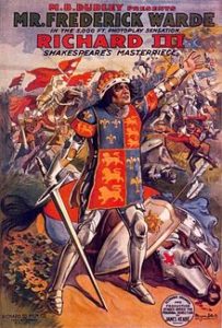
If you look back to the birth of cinema, film posters and artwork were used as nothing more than advertisements, specifying the film’s title and a brief outline, and not a whole lot more. In the 1910s, film distributers saw the value in revealing a little more; depictions of key scenes were really common, such as in the posters for Richard III and The Last Days of Pompeii, where sweeping battlegrounds and epic set pieces could be shown to attract audiences.
Stars Emerge
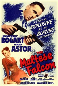
As the industry grew and matured, the studios began to see the value in their newly created Hollywood stars. Rather than individual scenes, imagery of the actors themselves became prominent along with an increased focus on typography. Huge hulking letters would appear throughout the posters to show audiences who they could see. Look at the famous posters for Frankenstein, Gone With the Wind or The Maltese Falcon and you’ll see what I mean.

Anatomy of a Movie Poster
By the time the 50s hit, artists became more conceptual and creative with their designs. Love in the Afternoon is notable for not containing a single person on it at all and Anatomy of a Murder contained nothing more than a stylistic chalk outline—in fact, the whole poster uses only four colours.
The Test of Time
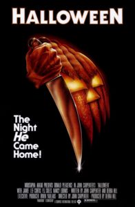
By the time the likes of Star Wars, Halloween and Alien rolled around, we were seeing iconic posters that you’ll still find proudly displayed in homes around the world to this day. Without even showing it, I bet you can picture that classic Jaws poster in your head instantly. It’s just that brilliant.
The Industry Gains Focus
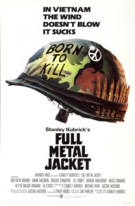
More than any other era, the films of the mid- to late-80s followed a distinct trend, but it was a bold one. It seems like every other movie’s artwork focussed on a single object, character or theme, and concentrated solely on that aspect. Think about the twisted plane from Airplane!, the army helmet from Full Metal Jacket, the Ghostbusters logo, and to cap off the decade, the Batman logo.
A Period of Transition
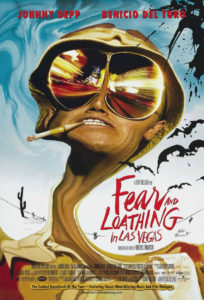
Today, there’s never been more variety when it comes to film artwork, from the mind-bending Fear and Loathing in Las Vegas to minimalist approach of Up. In many ways, this is the perfect time to be involved with the industry. We’re in a period of transition that allows me to design something as visceral as the original Howl key art, but also as exhilarating as my Palio work.
I really do think I have the best job in the world, as I’m passionate about what I do, and I’m desperate to live up to the greats of the past. Saul Bass, John Alvin, Richard Amsel and Drew Struzan are just some of the designers I still look up to and search for inspiration from any time I approach a new project.
It’s impossible to predict what the next big trend will be, but it’s going to be a hell of a ride finding out!